Post
At the start of last year, Atlus released a banger known as Shin Megami Tensei V: Vengeance. The UI is pretty cool, the gameplay fantastic, and the story solid. Overall, post-apocalyptic Tokyo has never been as stylish. I'll be discussing the UI from in-game after loading the save file. The game's UI features several things, of which I will explore:
- The main HUD from in-game
- The pause menu and its sub-menus
First up: the main game HUD
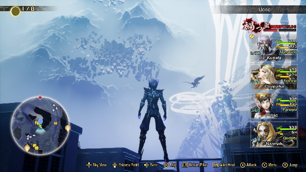
Welcome to mid-game. We are in Ueno. As you can see, on the bottom-left is the minimap which contains vital information such as:
- Treasure items' locations (the golden hexagonal boxes)
- Enemies and their locations (small grey arrows)
- Big enemies and their locations (usually big arrows. one is actually seen in the screenshot but is not in the minimap's scope)
- Small items and their locations (indicated with the little cat icon)
- The next story point I have to go to (big yellow checkpoint)
- My location and direction (green arrow)
- Leyline Founts (waypoints wherefrom we can fast travel to other waypoint as well as use other mechanics of the game like the shop and demon fusion, etc.)
Extending from the center-left of the screen on the bottom in a neat line to the bottom right corner are the action buttons we can take to:
- Open up sky view (just an overhead view of the immediate area)
- Enable the Estoma field (a shield that hides us from enemy detection)
- Save button (we can save from anywhere except in this spot called the Demon Haunt, but that's a safe area so it's fine)
- Open the map (we will explore this UI next)
- Use a return pillar (an item that will take us to the most recent Leyline fount we were at)
- Auto-heal (auto heal hp)
- Attack
- Open menu
- and jump.
From there, on up, we have the portraits and information of my main party of demons. From bottom-up we have:
- The fourth party member
- The third party member
- The second party member
- me (i am unremovable from the party)
The information displayed is enough to tell me that, for example, the demon Naamah of the Qadistu race is level 68, and has full HP but low MP, so that tells me I gotta use some MP restoring items on her so that I'm able to use her effectively in battle.
Above the part is the Magatsuhi gauge. Magatsuhi is a spiritual substance of sorts in game that when collected, fills the bar up. The bar just tells me how full it is. When full, I can use one special move from anyone in the main party without using up a turn. This special move varies, but that's a mechanics thing. Above that is the location. As you can see, we are in Ueno. The top left corner tells me what phase the moon is in in-game. This affects a battle mechanic.
You will notice also that there is a small notification icon near my character's portrait. This is to indicate that the character of the portrait has something to say to the main character in the Demon Haunt. The reason why my character has one is because Kunafa (yes i named my guy after knafeh), in order to become a Nahobino (notice the race label under the HP/MP), he must fuse with another character, so in the specific case of Kunafa, the notification means that Tsukuyomi (the entity he fused with) wants to speak with him. I promise it's not confusing, it's just a lot of words.
When moving around, the HUD disappears, which is pretty neat because it lets me take in the scenery.
An aspect of the main HUD that I think some people skip over is the camera angles. Camera angles in this game are pretty fine, standard even, but I do sometimes wish I could adjust my field of view. Otherwise, Atlus nailed the UI here. One thing perhaps to be consistent could have been to add that the RT button on the Xbox controller (and its equivalents), when held down, enable the user to sprint. But that could also clutter the UI. To compare, Zenless Zone Zero has an overwhelming UI, and I dislike that, even if the game itself is otherwise fine. SMT V is clean and neat, which I appreciate.
Now on to the (pause) menu and its sub-menus:
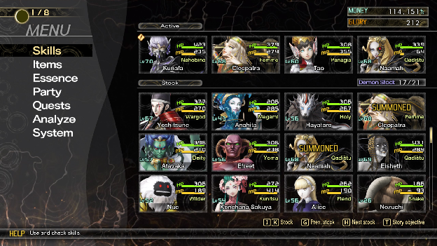
This is the first thing we see when opening the menu. The immediate information we get includes:
- The menu selection on the left, defaulted to the Skills tab
- The party and demon stock, with numbers telling me how full my stock is, and the demons listed in grid-format based on order of placement, somewhat.
The placement is a bit random since, for example, if I replace Naamah with Konohana Sakuya, Naamah takes Konohana Sakuya's place in the stock location, and then if I replace Konohana Sakuya with, for example, Anahita, then Konohana Sakuya would be where Anahita is after this. It's a little confusing and I wish I could sort them in alphabetical order, or based on level, or race, but this is tolerable. I kinda just stick to the three active ones unless I know I'm facing a tough demon later down the line. Moving on:
- Money and Glory. These are the two currencies used in-game. I need to know how much I have so that I can determine whether it's worth splurging on items or not.
Notice how there are also buttons at the bottom indicating "stock", "Prev. stock", "Next stock" and "Story objective". The only useful one is story objective as it just shoves a big pop up in your face telling you the story objective. The other three are to scroll through the stock demons.
If you select the "Skills" section on the left, that menu will be replaced with the affinities of the demon now auto-selected. Since Cleopatra is the first demon in my active party, she is designated as the first, so she was defaulted to.
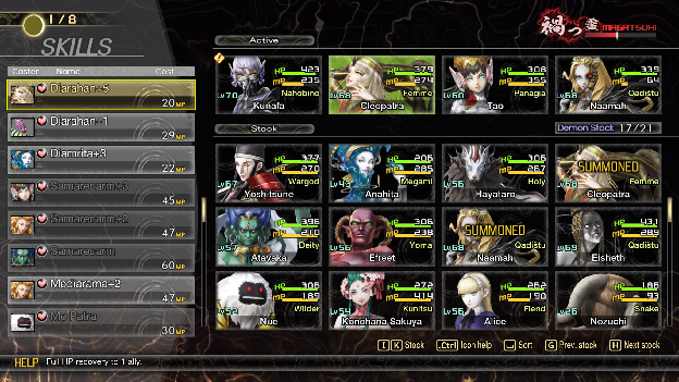
We see also that Cleopatra has been highlighted in green, while the Magatsuhi gauge returns to replace the money and glory, and the menu select menu has been replaced with a long list of skills and their respective demons. I like that it starts with support skills (indicated by the heart beside the skill name). It tells me how much MP will be consumed from the demon whose skill it is, with the small bar at the bottom helpfully telling me what the skill will do exactly. Diarahan is not the same as Samarecarm. Notice also how the buttons at the bottom have changed too: the scrolling ones have stayed but now we can get icon help and sort, which is pretty useful. My only gripe is that the list of skills includes skills unusable outside of battle, such as fire attacks and ice attacks. Why do we need that here? Most people opening this menu likely do so to access either healing spells or some other support-type of spells like estoma or trafuri (dungeon escape).
The Items menu next is the exact same except instead of the skills bit. Here's a cropped image:
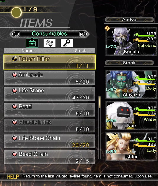
I am taking this while playing an active session so yes the demons may be inconsistent in between screenshots. Now. Notice how items are once again automatically sorted based on affinity: starting with the return pillar, which is a key item, and then support items. The greyed out items (and skills from before) are unusable in the current situation. Muscle Drink, for example, is only usable in battle since using it entails gambling with one's buffs or debuffs. We're also told how much of each item I have relative to my maximum stock limit of that item, so we know that I'm running out of bead chains but I'm full with life stone chains. Similarly I can look at other items I have such as vanity items (in the second menu if I press RB) and then key items related to the story or lore in the third section. I would rather that absolutely unusable items simply be undisplayed since it saves time and scrolling and mental energy.
The Essence menu is a little different to the rest. Essences are functionality that allows me to take a demon's affinities or skills as my own upon consumption of their "essence". It's a renewable substance in the game so no harm is done to any demons (unless i fight them in battle).
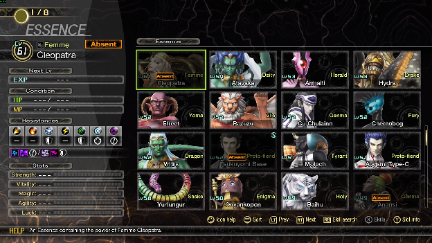
This menu sorts the demons by level (we can change that, but I prefer sorting by level), and tells us on the left side information about the demon as per its essence. Since it's an essence and not the demon itself, we don't have an "exp until next level" number or a HP/MP number. we have their affinities (resistances). Their stats are not shown either since that's dependent on the demon in my party. I've ensured Cleopatra is powerful, don't worry. A search bar would be nice.
Here's another half screenshot of the Party menu.
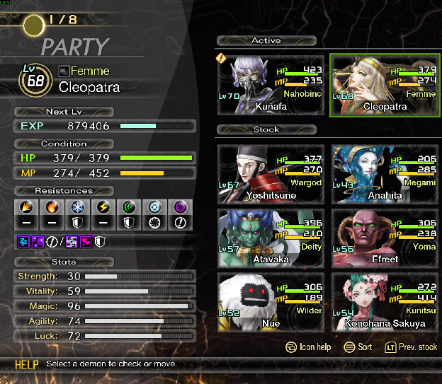
Unlike the absent essence of Cleopatra (which I used to yoink a skill from her), the real Cleopatra has full health, is halfway to leveling up, and needs to restore roughly 40% of her MP. If I select her, her icon will turn green, and if I select another demon be they active in party or in stock, the two will swap positions. I shared my complaint about this earlier. Fortunately for Cleopatra, I will not be benching her unless absolutely necessary.
The Quests menu is also fundamentally different. See:
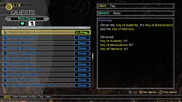
It's very simple. We scroll through the main quests, and are given a summary on the right of what we need to do and how our progress is. The side quests are the other menu and those shenanigans also operate the same way. We once again see the story objective button and now a main objective button, which opens the map and waypoints (on the map) where the necessary progress points are.
The Analyze menu opens up a massive list of all the enemies we've fought thus far. I'll set it to display the Bosses I've encountered.
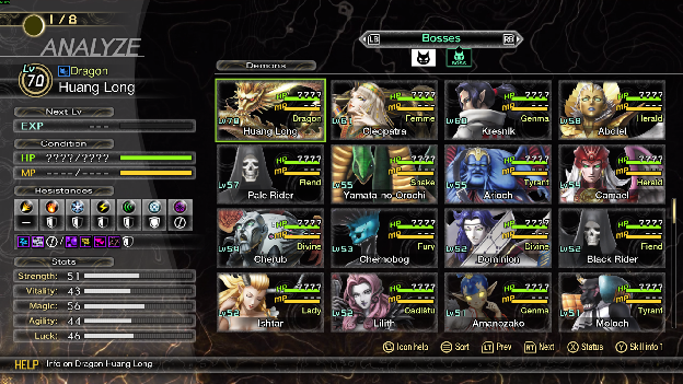
Indeed I have slain the great Huang Long. We are given the information as to the level, race, resistances, and stats of the enemy as we last fought them. Some bosses have multiple entries (such as Naamah, and yes she is an enemy too), since we encounter them multiple times. If we click on them, we open a menu where we can rotate the demon in question and see their affinities and resistances in more detail, as well as a bit of their lore. This opens up the stats menu.
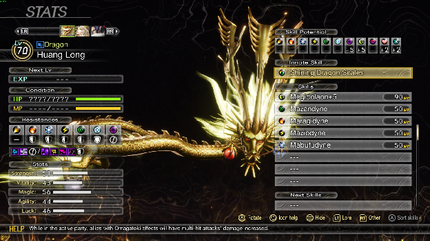
My only real gripe is that rotation is a bit silly looking with massive demons like Huang Long. He seems pretty strong though but unfortunately he's weak to dark, meaning he is susceptible to insta-kill attacks. We also see his skill potential which is just an indication of how much skills of those respective affinities will cost. Affinities in the positive will cost less than those in the negative. These are adjustable with items, but the weakness' affinity cannot be adjusted, except for the main character, whose affinities can be changed.
Lastly we have the System submenu which has a submenu of its own:
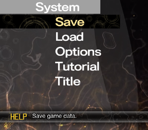
These are self explanatory. The save and load menus open up a menu that looks identical:
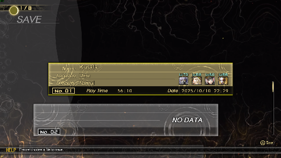
But when selected, do different things. Load will simply load the save in question (unless it's an empty one), and save will save it to the selected save data in question. There are lots of save data files so you could accidentally end up saving to a million files. It happened to me in another game. It was funny. Overwriting a save will always see a confirmation, while loading one mid game warns the user that unsaved data will be lost.
Then there's the options menu which just changes settings. I get pretty annoyed at the Button Icon settings. There are 4 types and a "standard" type. There is no active display of what the "types" are. The types are, after experience: PlayStation 5 controller, X-Box controller, PlayStation 4 controller, and Nintendo Switch controller. If the system doesn't detect a controller or detects mouse and keyboard input, it would default to displaying those keybinds. I find it stupidly annoying and wish that they'd just display the keys as I set them. The issue is that supposedly selecting a type doesn't necessitate the type being displayed. I have it set to an X-Box controller layout but it still displays mouse and keyboard often, which I do not want. I acknowledge though that the benefit is that if my controller dies on me, using a mouse and keyboard will not be hard because i have the displayed keybinds that'll tell me what to press to do what.
For the sake of this post, I have opened the tutorial menu for the first time since booting up the game. It just contains a list of tutorial popups organized in 5 lists: System Info, Play Info, Demon Fusion, Talisman, and Periapt. Opening any one of the latter two's tutorials just tells me that there is an effect that certain races of demons have when active in the party. It's a menu I see when I obtain the talisman or periapt. The only useful tutorials in these two menus are the ones that tell you what a talisman or periapt is. The other tutorials are more useful and self explanatory as to what they talk about.
Lastly is the title menu which takes you to the title. Remember to save your progress!
Overall I'd give the UX of the game around 8.121/10. The difficulty gets progressively easier if you play as I do, and there are means to nerf the difficulty further. The interface is really nice and fluid aside from the few hiccups here and there. There are more menus I'd like to have talked about but this post is getting pretty long. I strongly recommend this game.
References
ATLUS. (2024, June 13). Shin Megami Tensei V: Vengeance [Video Game] [PC (Steam)]. Steam. store.steampowered.com
Qureshi, S. M. (2025). Discussion Post 1 [The discussion post's prompting for UX230 Interaction Design in Fall 2025 at Wilfrid Laurier University. The page is no longer accessible publicly or privately.]